Facebook Timeline for Business: First Impressions
Facebook Timeline had me at “Helloooo, cover photos!” For me, the changes to my personal profile back in the Fall were love at first sight. And from what I’m seeing already, I’m going to be just as enamored with Facebook Pages.
It comes down to eye candy, right? You’re in the mall, and signage catches your attention. You’re in a store, and a display attracts you to a cluster of products. You’re on Facebook, and a brand page with gorgeous visuals pulls you in. Uh –
Not so fast! That’s not how it’s been working. Brand pages have not been destinations. We encounter items in our news feeds, either via updates directly from the brands we “like” or via our friends’ interactions with brands. That’s not going to change. Content that is shared by brands and friends will continue to be the primary source of activity. We can like it or comment on it without ever having to leave our news feeds.
However, if you’re like me, since the roll-out of Timeline, I’ve been leaving my news feed more and more to explore my friends’ profiles. I love seeing their cover photos, the slicker-designed albums and a time or two, I’ve scrolled back in time for a walk down memory lane. It’s too early to know how much of this early curiosity will wear off after Timeline becomes old-hat, but I’m betting brand fans will act the same way for a while, stopping over to brand pages to see what’s new as a result of the updates.
So here we are at the beginning (the most recent beginning, anyway), and Facebook’s listed three huge benefits of its new pages: branding your page, highlighting what matters and managing everything in one place. Lots of brands were invited to set up their pages early, and others are working to publish as quickly as they can, so we already have dozens of examples of what can be done. Let’s see who’s already taking advantage of what Facebook has defined as the focus:
Brand your page
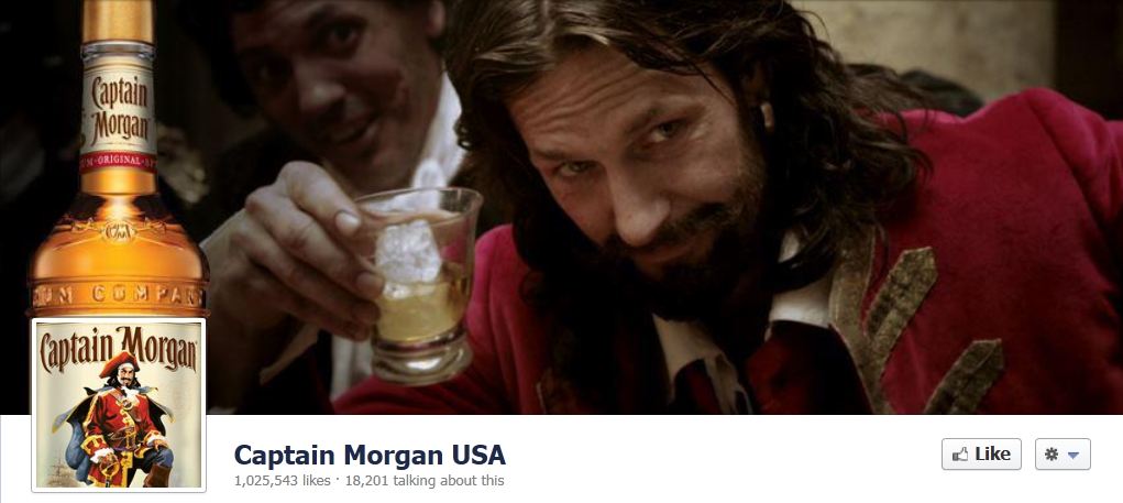
Among the new opportunities for branding through the new pages are cover photos. Brands are going to be very creative with this image, and you can bet they’ll be changing them up regularly. Already, brands seem to be having a lot fun with it. Check out Captain Morgan USA, which combines the box containing its logo with its cover photo to make it appear a full bottle is in the foreground:

And you can see by Toyota’s cover photo which captures motion with the blur on the left and the in-focus pup on the right, the space is big enough to, among other things, employ the tricks of great composition:

Just as with personal timelines, brands can also highlight news to showcase special items. This stretches status updates across the entire width of the page, interrupting the 2-column timeline to draw attention. Livestrong is doing this now to ask people to go into their memories and tag the Livestrong timeline for the “moments which you took part.”
Nike is utilizing both options at once for product promotion. Visiting its page, where the cover photo and at least two stories highlight it, it’s impossible not to notice what this brand is trying to move: its Nike+ Fuelband.
Highlight what matters
Unlike highlighted posts, which fill both columns but scroll down the page as new content is posted, “pinned” posts (interesting word, right?) stay at the top of the brand page. Since there’s a time limit – 7 days – it’s clear Facebook wants to encourage brands to keep content fresh.
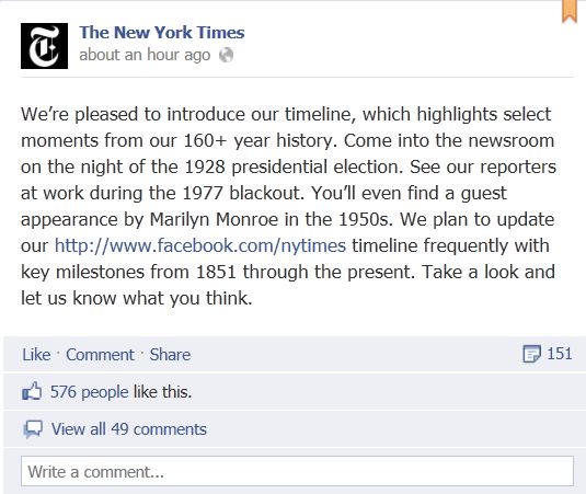
Right now, American Express has pinned to the top of its page a special offer for card members, Red Bull has pinned what is one of the first games/contests on the new pages and The New York Times has pinned a note about how its timeline goes back to 1851. They didn’t have Facebook back in 1851, as I recall, but as you can see, it’s not going to take brands long to make up for lost time.

Manage everything in one place
In order to show that the new pages are more than just pretty faces, Facebook has included with this roll-out more seamless page management tools. The new admin panel features notifications of recent activity, including a separate space announcing new page likes; a section for private messages (a new feature that’s sure to add depth to the customer service opportunities and responsibilities for brands on the platform) and easy access to page insights.
Watch soon for the next installment of Media Logic’s DECODED series in which we’ll be digging beneath the glossy surface discussed in this post and decoding the fundamental changes in how pages function in social marketing, including high visibility of your friends’ interactions with the brand and the advantages of including photos in your posts.


