Using the Rails to Make a Co-Brand Credit Card Connection
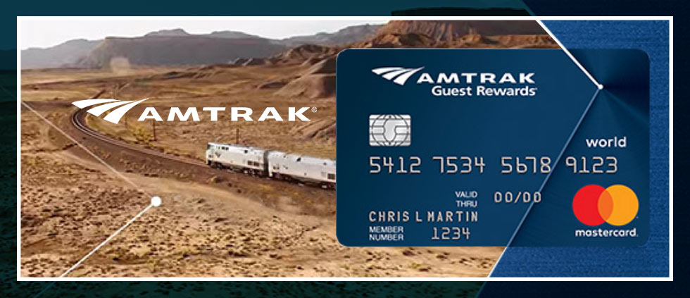
One struggle particular to co-brand credit cards is how the to integrate the card alongside a master brand, where consumers normally have a stronger connection. Media Logic works with many co-brand programs, so we’re always on the lookout for examples of companies who are doing a good job with this type of integration. Sometimes we find examples in unexpected paces, like the 6 a.m. train from Albany to New York City.
The Amtrak Guest Rewards card is not usually at the top of the list when it comes to competitive reviews of co-brand cards, but that’s not a reflection of the card’s value proposition. The card has a rich sign-up bonus, and the points earned are very valuable, at least according to the The Points Guy, who is considered an authority on that matter by both consumers and issuers. If you ride the rails a lot, this card is for you. The reason the card gets overlooked is that it stands in a category of its own: a competitive review of railroad co-brand cards is a review of one. But brand integration knows no category boundaries, and it’s there that Amtrak excels in ways we don’t always see.
The “master brand” for Amtrak was refreshed in 2015 with the introduction of a simple, and ownable, brand element: the “journey lines.”

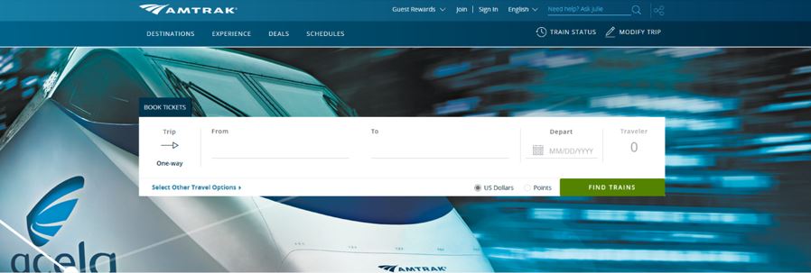
When I first saw the simple point and lines used by Amtrak, I got it right away. Like the connections on a train map, this graphic element represents the journey and the destination and appears in many places, including:
The passenger rail service’s main website –>
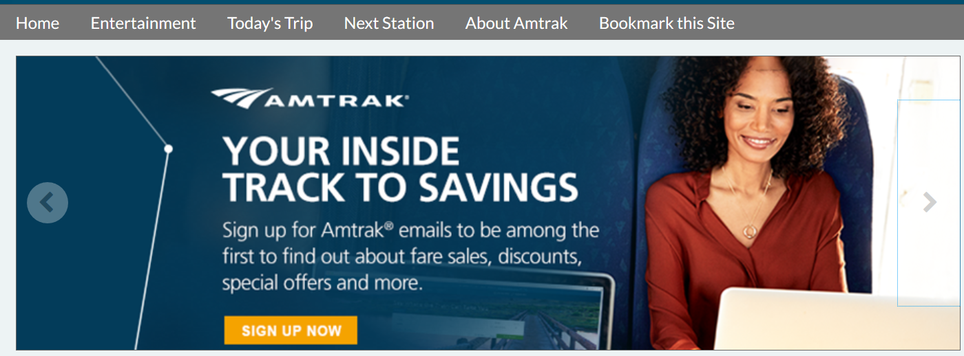
After Wi-Fi log-in on the on-train website, called Amtrak Connect –>
Amtrak’s mobile app –>

The cover of the on-train magazine, The National –>
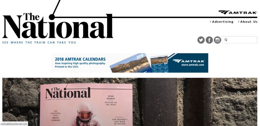
In-station signage –>
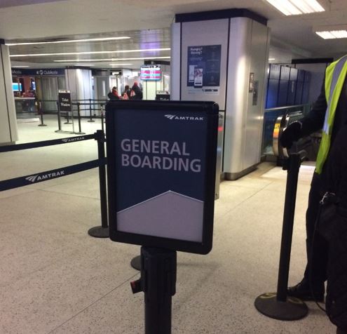
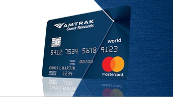
This kind of consistency shows a commitment to brand integration on the part of Amtrak, which further extends the element to the design of its loyalty co-brand credit card:
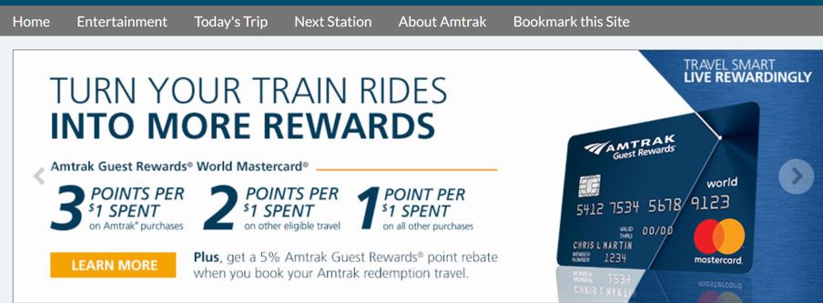
The card is also well promoted through Amtrak’s websites (both Amtrak.com and Amtrak Connect):
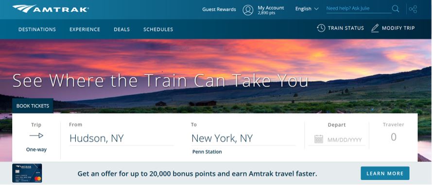
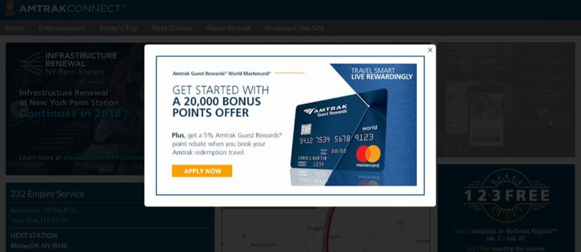
And there is an interstitial when riders log-in to Wi-Fi:
None of this is breakthrough or revolutionary. Co-brand cards are supposed to be extensions of the master brand. It’s considered best practice to integrate elements like colors, image style and typography from the master brand into the card brand, all while creating a distinct product that consumers will want to use “off brand.” However, many co-brand cards do the bare minimum and slap on the logo to make the connection. Others come up with something so distinct that the brand connection is lost.
Amtrak provides a great example of how card marketers can work with the elements provided to them from a master brand to both make a connection to the co-brand card and allow it to the stand out on its own.


