Citi Double Cash Card Welcome Kit: Chock Full of Best Practices
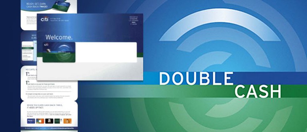
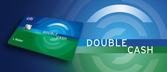
This is not the first time we’ve written about the Citi Double Cash Card: we’re not hiding the fact that we find the product intriguing. In a sea of complicated rewards cards, this product’s simplicity stands out. And as marketers, we like how that simplicity translates into the card’s marketing efforts.
We last noted how we appreciated the card’s “incredouble” social promotion that paired two great things together because it effectively played off the product’s positioning and value proposition (double cash back).
Since then, we have seen the card’s welcome kit and must report that we admire it, as well. It adheres to just about every EMOB best practice we preach.
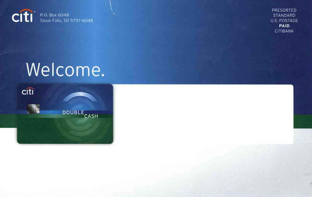
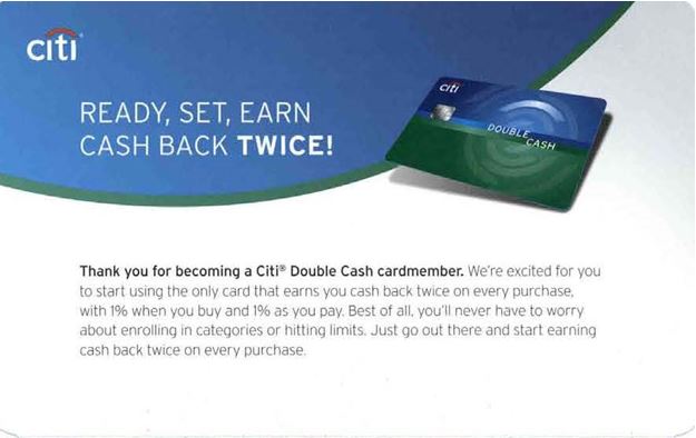
First, the OE clearly welcomes the cardholder to the card and to twice the cash back – not in an overly clever way, but in a succinct, simple manner.
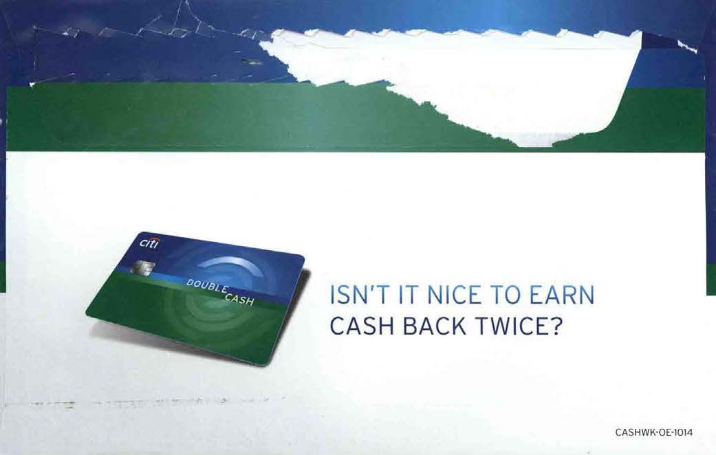
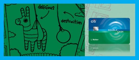
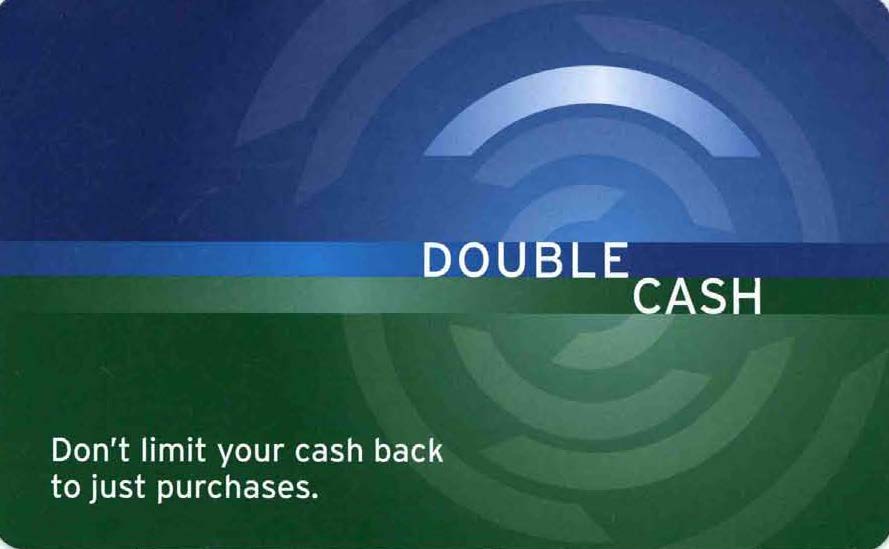
Open the envelope and you’ll find a single insert – no letter, just an insert – with a cover that carries through the product’s actual card design in both shape and design (there’s no mistaking the product identity here).
Expand the accordion-fold insert and you will find engaging, yet short and scannable, content, along with best practice after best practice, including:
- reinforcement of the card’s value prop, followed by short copy that expresses the product’s positioning (“The only card that earns you cash back twice on every purchase”).
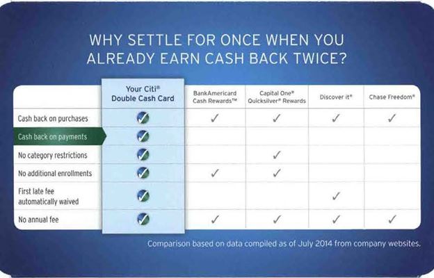
- an easy-to-read chart that visually compares the product to other leading cash back cards and wisely highlights the card’s strengths and – more importantly – its key differentiator (cash back on payments).
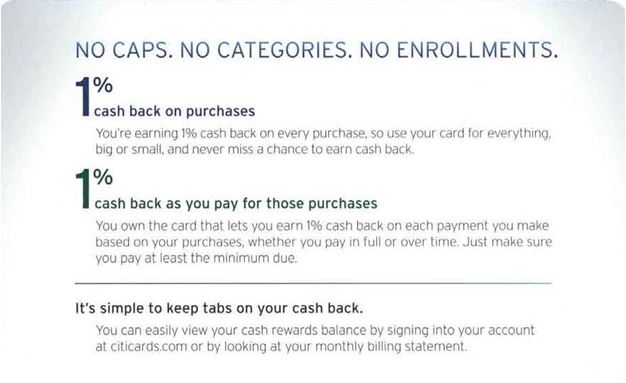
- clearly articulated “earn” without limits (1% back on purchases and 1% back as you pay for purchases) along with no caps, categories or enrollment.
- clearly articulated “burn” structure and redemption options (telegraphed effectively using merchant logos).
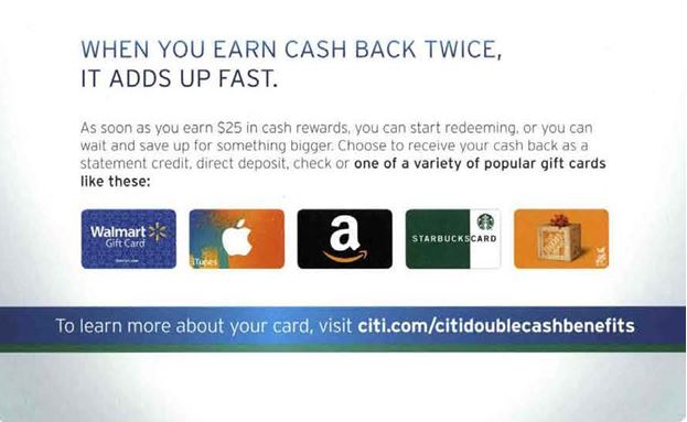
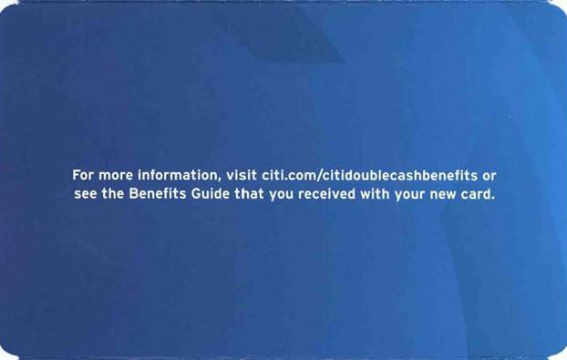
- a single call-to-action (pictured above: to learn more about your card, visit the card’s marketing page).
- a succinct summary of product benefits in the form of an easy-to-read checklist on the reverse side of the insert, above the legal disclaimers.
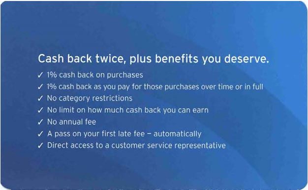
- a repeat of the single call-to-action (for more information, visit the card’s marketing page) following the product benefits summary.
If we had one bit of constructive criticism, it would be that the explanation of the 1% back as you pay for purchases is not advanced from the acquisition DM. This may leave cardholders wanting more information, but that explanation can be found on the card marketing page.
Otherwise, the card’s welcome kit is so simple and so effective: no multiple pieces to flip through, no guesswork needed (benefit language is clear and succinct leaving nothing to be misunderstood) and no multiple calls-to-action to confuse the reader.
Well done, Citi.


