When Is Less More? Plain-Text vs. HTML Email

The argument against advanced HTML emails used to center around how they couldn’t be supported across mobile channels, but advances in technology have eliminated many of those barriers. However, now that HTML-heavy email is a viable option, is it always the most effective approach for your email marketing? New evidence suggests it may not be.
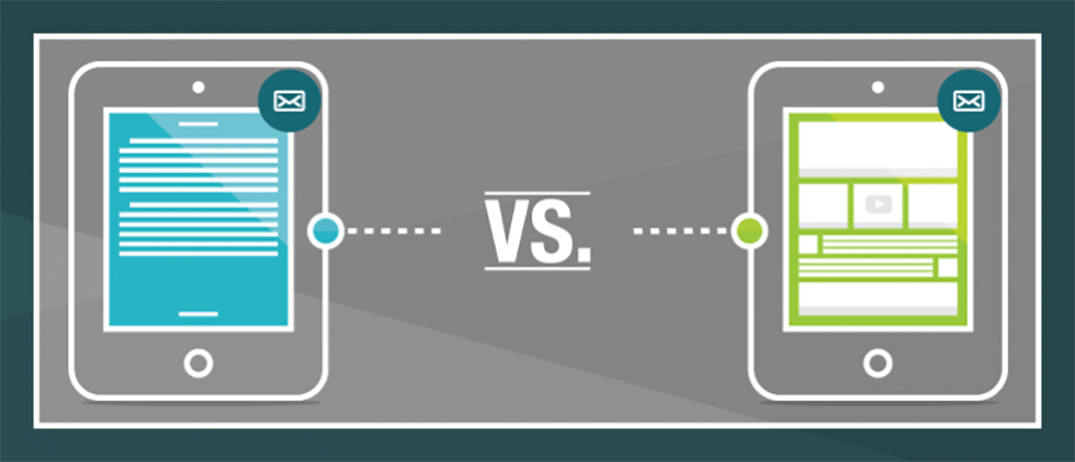
According to a report by Hubspot, nothing boosts opens and clicks better than plain-text emails.
This seems to fly in the face of other research pointing to the effectiveness of HTML email tactics, including video. But there may be something to the plain-text email argument. Here are three things the Hubspot study points out:
1. Plain-text has better deliverability
Simply put, HTML emails do not have as good of a deliverability rate because bad coding and lack of a plain-text version are two primary spam triggers. Correcting these two errors seems to level the playing field, but even when all is equal, plain-text emails have higher open rates.
2. Filtering reduces the open rate for HTML emails
More and more email services are adding filtering services and moving those that appear to be commercial in nature to a special folder. Because of this function, emails with image tags and complex HTML templates are more likely to be filtered away from the target’s primary inbox and, consequently, not opened.
3. Plain-text has higher click through rates
While you’d think designed emails with images and buttons would always be more effective, it’s not necessarily true. According to the study, HTML emails consistently had lower click through rates than their plain-text emails.
For the plain-text vs. HTML template with images test, the HTML email version had a 21% lower click through rate. And when combined with the lower open rate, the HTML email had 51% fewer clicks.
The study’s assumption is that email is perceived as a form of one-on-one communication. Since plain-text emails look more personal, they are more likely to perform better.
This explanation makes perfect sense for simple, personable emails meant to come from an individual, such as a follow-up from a sales consultant or an email with a simple, straightforward call to action (to sign up for a seminar or download a white paper). However, it doesn’t necessarily apply to all emails. For example, it’s unlikely anyone believes GAP is sending a personal email, and in that example, a plain text version of a promotional email is not likely to perform better than one that showed an image of the featured sale item.
What we can all agree on: Simple is better
According to the research, even when HTML emails were A/B tested, the more simply designed templates performed better than HTML-heavy templates. This makes perfect sense when you consider the fact that more people are reading emails from their smartphones while on the go. They don’t have time to navigate complex emails. They want simple communications with an immediate, clear call to action.
What does all this mean?
Even though technology is giving us more tools than ever, email marketers need to take a “less is more” approach, with efficient and succinct messaging and design. And, when the communication warrants a personal one-on-one approach, don’t be afraid to go with a plain-text format.


