Simple Bank Proves Privacy Policy Updates Don’t Have to Be Boring

Did your bank’s annual notification about its privacy policy come with a puppy picture? Mine did. If that sounds frivolous to you, it’s possible your bank experience has left you feeling cold and empty.
Of course, it isn’t entirely your bank’s fault: privacy policies (no matter the source) tend to be anything but inspiring. However, what Simple did with this bank customer communication not only challenges that notion but also transforms a compliance requirement into a marketing opportunity.
These kinds of customer communications are legally required. Simple is just like every other bank: it has to notify its customers. But Simple isn’t treating the task like every other bank. Here’s how the brand framed a customer email about the annual privacy policy updates and disclosure of guidelines for electronic fund transfers: a celebration.
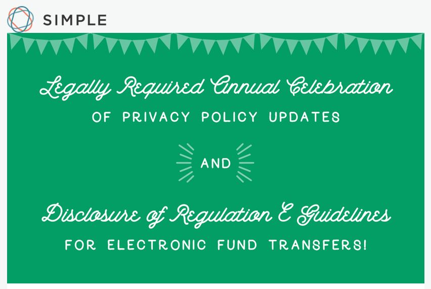
The “Legally Required Annual Celebration” is tongue-in-cheek, of course, a tone Simple maintains successfully throughout the email:
We arrive in your inbox today for a joyous-ish occasion: The Legally Required Annual Celebration of Privacy Policy Updates and Disclosure of Regulation E Guidelines for Electronic Fund Transfers! Hooray!
Hooray? If that sounds like the opposite of the typical emotion related to legal compliance, you’re right. Here’s how Simple pulls it off:
1.
Precise branding
This customer communication is personal, conversational and clever. In other words: totally on-brand for Simple. While many financial services companies only “brand” disclosure emails with a logo, Simple pushes branding deep into both the concept and the language to create a customer experience that meets its brand promise.
2.
Relevance (X2)
Simple’s email leverages one type of relevance (the zeitgeist) to deliver another (usefulness). The brand demonstrates it is “in the know” about how consumers feel toward legal documents, and as a result it captures my attention long enough to tell me why any of this matters to me.
3.
The right tone
While many in the world joke about privacy policies and terms of usage, these documents are still quite important to the financial services industry. Simple straddles that line very adeptly. It writes, “If [disclosures of regulations] somehow sound both boring and kind of scary, don’t worry. It’s not a huge deal, but the information is pretty important. We’ll do our best to make it a bit less boring.”
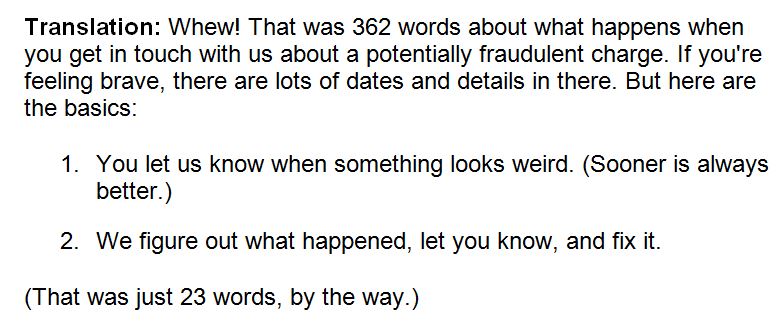
The email is humorous but also gentle and patient as it conveys necessary information, including translations of “legalese” within the email itself and a link to the full privacy policy.
4.
Strategic formatting
Simple utilizes some email marketing best practices:
- Subject line: The subject line – Rabble, rabble, rabble. (Translation: required legalese enclosed.) – grabs my attention. It uses language that is different from anything else in my in-box.
- Body: Beginning with the opening lines, the copy entertains me, and the formatting makes it easy to read despite its length.
- Expectation of importance: I know from past experience that Simple only emails me when there’s something I need to know. This pattern makes me less likely to delete the email from the get-go.
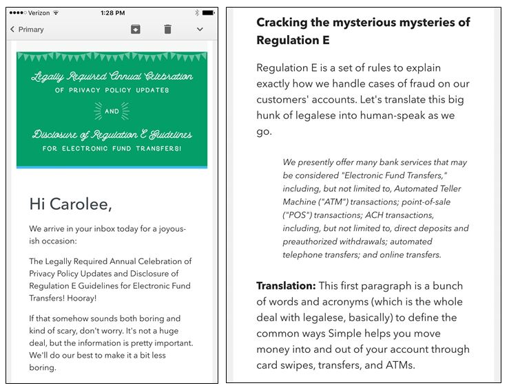
- Responsiveness: My emails from Simple are always responsive, as they should be. Simple is an app bank: I’m typically on my mobile device when I interact with the brand. Here’s how the email looks on my smartphone:
5.
Surprise and delight
Don’t worry. I didn’t forget about the puppy. The puppy photo is the reward for reading (or at least scrolling) all the way through an email from my bank. However, it is not the only reward. Simple writes, “Did you make it this far? If so, you now know more about bank rules than most people in the world. You also get this puppy photo.”
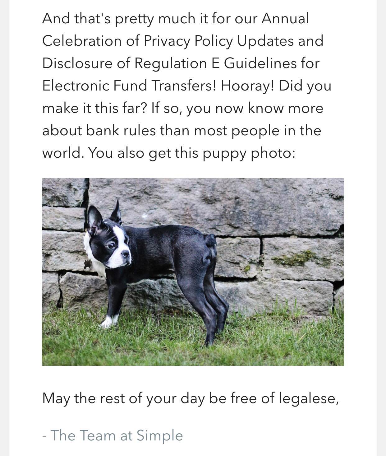
Frivolous? Hardly. My bank created a memorable experience from something super mundane. Not only did I read the email, but I felt good about it.


